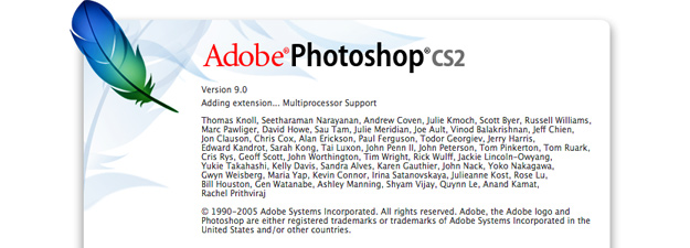
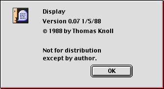
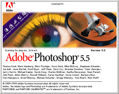
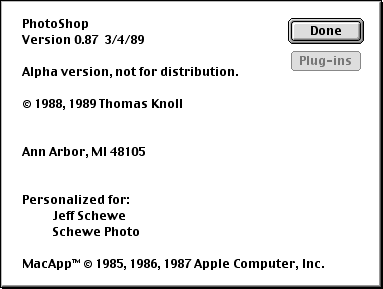
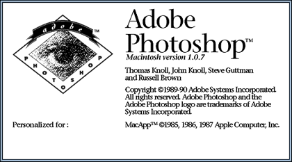
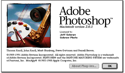
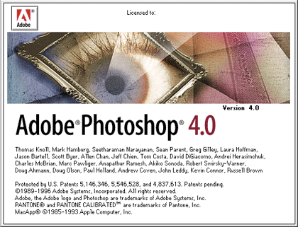
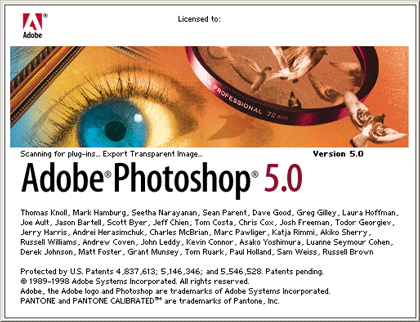
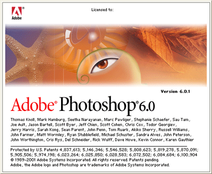
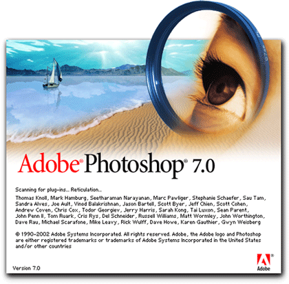
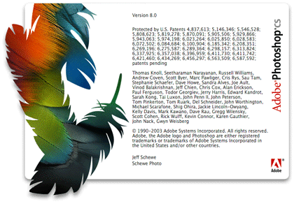
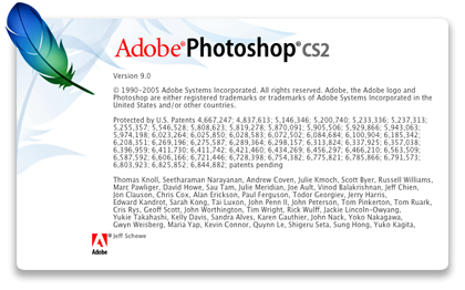
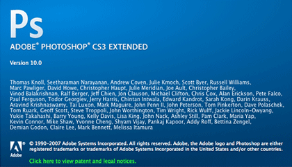
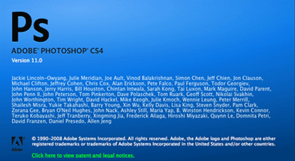
Here’s a look back over 20 years of Adobe Photoshop welcome screens, I’ve now updated the article with Photoshop CS5. Every release of Adobe’s industry standard photo editing software prior to 6.0 is alien to me, but perhaps those horrendous 90’s splash screens will bring back memories for some of you.
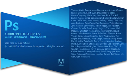
I guess it’s a matter of personal taste, but I think they got it right with CS2. The new Mac OSX–inspired bold primary hued gradients, soft bevels, transparencies and drop shadows seem to be the in thing at the moment (even Microsoft have joined in), but I’m a fan of well used clean white space.
Danny

it was very interesting to read.
I want to quote your post in my blog. It can?
And you et an account on Twitter?
Sure, go for it 🙂
My twitter is @dmeadowsretouch